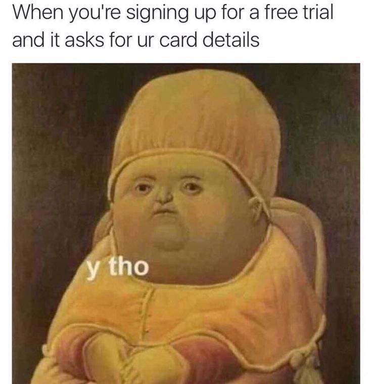
You just signed up for a new software product, excited to dive into its promising features.
In this situation, you are facing this issue not as a SaaS founder but as a user of another SaaS product. You signed up as a user interested in the solutions, with needs and problems.
Within the first two steps, confusion creeps in. The promised experience quickly turns into confusion, unclear instructions, and a cluttered screen of product instructions. There is no support to help get through the confusion. You try to skip every question because you find them unnecessary. You get frustrated and (probably) delete the new account immediately.
Sound familiar?
This is how users face similar issues during the initial onboarding stages when using your software.
What does this mean?
Your potential users are humans with a short attention span. The first steps of user onboarding can make or break the user's perception of the software and determine whether they will become loyal customers or abandon the product entirely.
Did you know? Poor onboarding is the third most important reason for customers to churn, right after the wrong product fit and lack of engagement.
How is this important?
8 in 10 users say they have deleted an app because they didn't know how to use it. This includes users who bounce out of an onboarding process because they don't see the "stress of the sign-up" process as worth it.
In their minds, there should be an easier and better alternative. This occurrence that can break a user's perception of the software is called product friction. These are obstacles in your user acquisition and onboarding that may lead to higher churn rates than normal.
I'll help you.
- Understand what product friction is and the challenges users may be experiencing leading to higher churn rates,
- Identify product frictions in your software.
- Provide strategies to help you create a seamless user-onboarding process.
Table of Contents:
- Introduction
- What does this mean?
- How is it important?
- What is product friction?
- What is user onboarding in SaaS?
- What is product friction in SaaS user onboarding?
- Examples of product friction in SaaS user onboarding
- 5 strategies for reducing product friction in customer onboarding
- What you can take home
Taking it one step at a time, let's understand what product friction is.
What is product friction?
Product friction is any obstacle or frustration users encounter while attempting to navigate and make the most of a product.
I interviewed Joseph Saqid, Product Manager at Alpha GIG Logistics and CEO of Product Profs on what product friction.
"Product friction is simply when a user finds it hard to use your product in one way or another. In product management, 'good user experience' is when a user can easily use your product without having to check out Google for assistance. The moment a user or customer starts browsing how to use a feature on your product, that's a sign of product failure and product friction." -- He says.
What is User Onboarding in SaaS?
User onboarding in SaaS is guiding new users to adopt and effectively use a SaaS product or service. This includes all activities that educate and engage users, ensuring that they have a successful and positive user experience.
You should note that user and customer onboarding begins immediately when a prospect learns about your product and interacts with it. For SaaS, user onboarding begins before product sign-up.
People discover products in different ways. Some through ads, social media, app stores, and others through search engines. Unlocking a seamless onboarding process begins with optimizing all stages of user acquisition and onboarding - beginning at the stage of product discovery to nurturing and sales. Includes optimizing landing pages like pricing and comparison pages, and marketing channels like email and resource hubs. In addition to this, the value advertised must be equal to the value users experience while using the product, or else they will churn. If the experienced value is the same as promised, this can lead to customer retention and loyalty.
What does this mean? You should note that:
- Customer onboarding does not begin with product sign-up. It begins the moment prospects search for products like yours and learn about them. Optimize.
- Perceived value must be equal to experienced value. Don't preach ease and sell otherwise. That's bad marketing.
What is Product Friction in SaaS User Onboarding?
Product friction in SaaS user onboarding is any resistance in an onboarding process. These are obstacles users experience during the onboarding process, either during sign-up, profile set-up, feature use, etc. According to Joseph Sadiq, this could be technical issues, UI and UX issues, or a prolonged onboarding process, etc.
A year ago, I was searching for an easy landing page builder. Most websites I found in search results preached nothing like their products. The websites said “Create a simple landing page with no skills required”, and “Create a simple landing page in 5 minutes from your smartphone.”
Not at all! I could not do any of that. Instead, I needed to edit with a desktop, and for most of them I needed basic design skills to align the elements. I deleted my account out of frustration.
Examples of product friction in customer onboarding
Listed below are some examples of product friction in SaaS user onboarding:
- Unnecessary steps in the sign-up and onboarding process
- Distracting and unnecessary features on screens
- Selling false experiences as click baits
- Complicated user interface and designs
- Technical issues like OTP codes, bugs and verification issues
- Lack of personalization in the onboarding process
- Poor support and customer service
Let's break it down one at a time.
- Unnecessary steps in the sign-up and onboarding process
The aim of your new user onboarding is to get the user to the 2-3 features that are responsible for getting them to experience product value. Unnecessary steps and features may lead to confusion and it cuts the flow to gain value. For example, the sign-up screen has one goal, and this is to help the user create an account. The next process may be a survey for personalization. The goal is to understand the user's needs and direct them to a solution. Asking for personal information that isn't necessary for segmentation may cause friction.
2. Distracting and unnecessary features on the screen
We all hate it. Scrolling through a web page and a pop-up covers the screen. The worst part, we can't find the "close" button or option. Things like this can be frustrating.
Also, there is a rush to push out features to new users as they sign-up, forcing them to explore it. In most cases, these pushed features don't solve users' needs immediately. This can be overwhelming, as they may not need it at that point.
3. Selling false experiences as click baits
Clickbait is not used only on social media. Click baits are also used on web copies and app stores to push people to take action or believe something false. For instance, my experience with some landing page builders which promised value I never achieved.
A popular example is promising a free trial, but users can't do anything without paying. 60% of the time people bounce off. I exit and don't look back–why would you do something like that?
4. Complicated user interface and designs
In UI design, first impressions are important. In onboarding screens, a bad UI can cause product friction. I asked a friend Dera, a freelance product designer, how bad UI can make onboarding screens less effective. These are his thoughts from experience:
- Confusing and cluttered screens: When users are presented with a lot of information at once, it's difficult to understand what they're supposed to do. This can lead to users getting lost or confused, which can ultimately lead to them abandoning the onboarding process altogether.
- Unclear calls to action: Users need to know what you want them to do next. If the call to action is unclear, users may not know what to do or may be hesitant to proceed.
- Lack of personalization: Onboarding screens should be personalized to the individual user. This means using their name, their interests, and their goals to create a more relevant and engaging experience.
- Technical glitches: Technical glitches can be a major source of frustration for users. If the onboarding screen doesn't load properly, or if there are errors in the forms, users are more likely to abandon the process.
5. Technical issues like OTP codes, bugs and verification issues
Technical errors can lead to prolonged onboarding processes, which can increase churn rates. Some technical issues include:
- Delayed OTP codes - OTP codes are sent after 1 minute and are not given multiple options for receipt.
- Bugs and glitches refresh screens or take users back to the previous steps.
- Authentication errors. Includes forcing users to prove they are human every time before they can load a page.
- Others include payment issues and integration issues.
6. Lack of personalization in the onboarding process
The importance of requesting a user's details is for personalization and segmentation. When users are asked for this information, they expect immediate solutions to their needs. According to Salesforce, 70% of consumers say that how well a company understands their individual needs impacts their loyalty. If a user doesn't feel like a product solution was created for them, they may find the product irrelevant. For example, a task management product created for individual consumers could contain features like notes, task lists, planners etc. Including features like team management may seem irrelevant.
7. Poor support and customer service
The truth is no matter how smooth your onboarding process may be, more users and customers will need help along the line. This is why customer support is essential. New users will need assistance, customers will help, and good customer service will decide if they turn into advocates or not. If new users can't get connected to support or help in the middle of an onboarding process or a sign-up error, there's a high chance they will churn. This includes being able to talk to a sales rep while trying to select the best pricing package for their team.
5 Strategies For Reducing Product Friction In Customer Onboarding
- Create a clear onboarding process
Streamline your onboarding process. If users have to go through a lot of steps to get started, they're more likely to give up. Make it easier for a user to navigate the product and gain value in the first 3 steps of product use. Your product onboarding should focus on the most important features that solve the problem. Do this by focusing on a 2-3 sign-up process that leads users to the "aha! moment." The safest practice is using welcome screens and micro surveys to confirm the user's needs and direct them on how to achieve them.
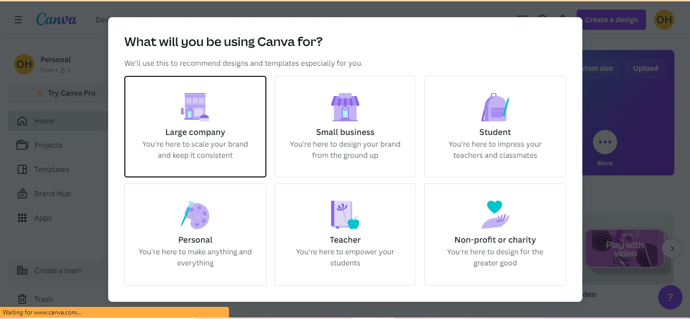
Example: Canva’s personalisation survey
Canva’s product sign-up is one of the easiest I have experienced. You don't need to provide much information when signing up for Canva's product. An email sign-up creates an account in less than a minute. Canva asks new users about their goals while using the product, and the user’s answer guides them through the next stages. Aside how easy it is to solve a design problem with Canva, it is easier to get started using the product.
Takeaway: Remove unnecessary steps that don't add value to the onboarding process and focus only on the first 2-3 steps that solve the user's needs.
2. Create good UI design patterns
User Interface design patterns are recurring components which designers use to solve problems in user interface designs. They are effective in creating user-friendly interfaces and improving user experience. These could include:
- Welcome screens - create personalized experiences and guide users through the next steps. Welcome messages, personalization surveys, and next steps instructions should be included.
- Product tours - communicates product values and benefits through product features. This includes a short text description, tooltips, and a demo video.
- Progress bars and checklists - encourages users to complete the onboarding process and gain full product value.
- Gamification - motivates users and builds momentum, while improving product interactions.
PS: Onboarding patterns like product tours and checklists should be optional for users. This is to give users the flexibility needed to explore the product on their terms and minimize frustrations. Include a "skip for now" or "later" option while reminding them from time to time to complete.
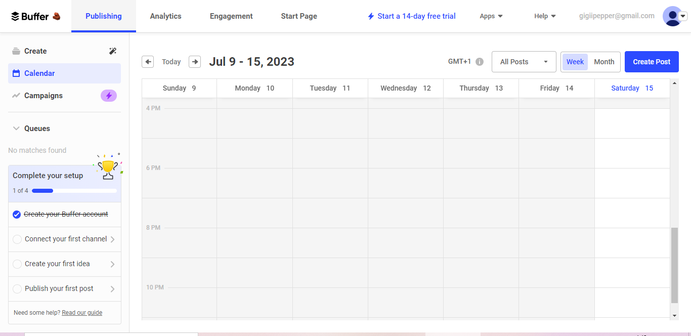
Example: Buffer’s new account checklist
Takeaway: Design patterns improve user experience. They include welcome screens, optional product tours, gamification and checklists.
3. Provide easy customer support and self-service options for users
There are two types of people,
a. people who like to solve issues themselves and
b. those who need help from others.
Optimize for both.
The customer support system involves managing customer communication and help. They include email support, FAQs, live chats, resources and guides, etc. Customer service is important because it builds loyalty, reduces churn and retains customers.
Resources should be made visible for users and easy to navigate. For example, your resource page could be organized into sections for users who prefer to solve issues themselves. Additionally, provides faster and easier contact options for users who wish to contact support. For example:
- Chatbots
- Customer service team. Set up a response team that responds to emails and calls within 24 hours
- Community forums for users
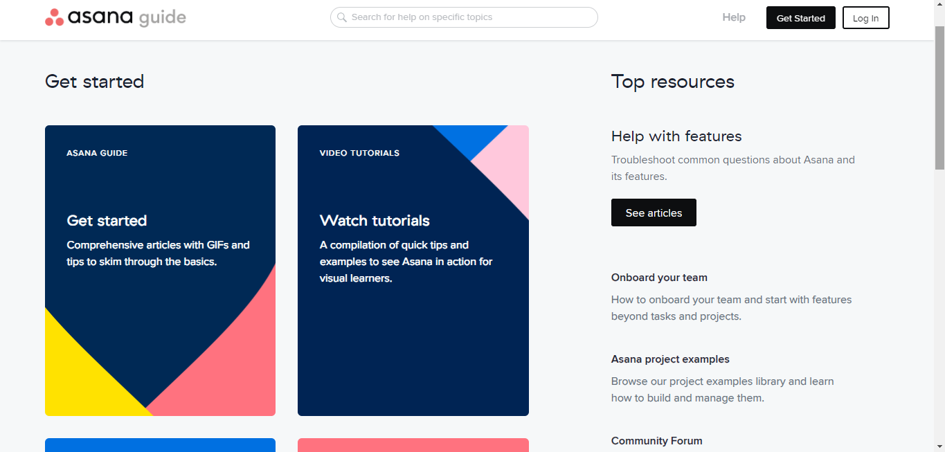
Example 1: Asana's resource page
Asana’s guide/ resource page is easy to navigate. Visitors can discover the resources and support they need while using Asana and managing projects. The resources are arranged in sections based on the formats and type – a perfect example of a good resource hub.
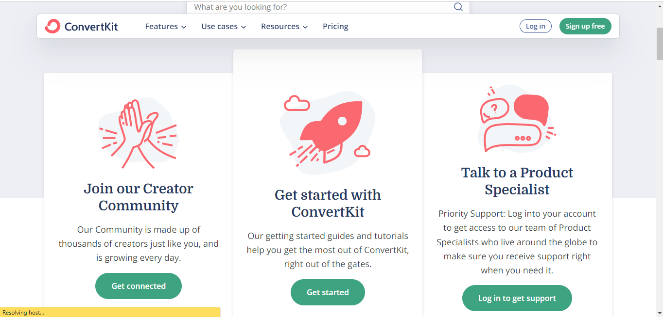
Example 2: Convertkit support page
Convertkit support page gives you access to a library of guides, the Convertkit creator community and product specialists. You can easily search for what you need, from articles to demos, to tutorials and walkthroughs.
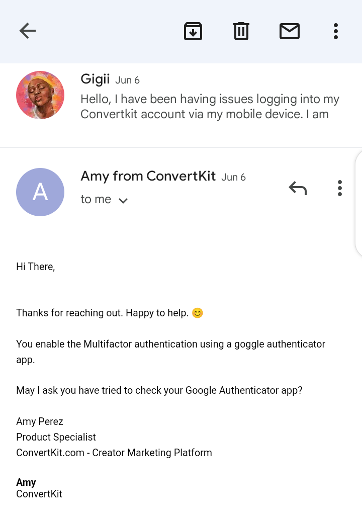
Example 3: Convertkit email support service
Asides having a helpful resource bank, their email support is top notch. I host my newsletter on Convertkit. Whenever I need help with issues that blogs can't solve, the product specialists are always active to assist. That's how they have converted me into an advocate.
Takeaway: Resources should be made available for users who prefer to solve issues themselves and others who don't. Provide easy and fast support channels like emails and chatbots to assist users.
4. Leverage user feedback and data
Collect user feedback and conduct surveys throughout user onboarding – and use them. Some tools provide data on how users interact with your products like Hotjar and Pendo. Surveys could be sent through emails or in-app after a user has completed the first stages onboarding process, like profile set-up, channel linking, data upload and creating their first project. The results from these could also help in launching new products and product innovations. The data can also be used in producing content and improving your marketing.
Takeaway: User feedback and data can be used to reduce product friction by showing you how users interact with your product – if they are receiving value or not. This can help in product innovations, marketing and creating better user experience.
5. Fix the technical and marketing issues
There are some other ways to create seamless user onboarding. And some of them are by resolving backend issues and improving your marketing behind the scenes. These issues in detail are:
- Fix bugs and glitches that crash apps or refresh pages during product usage. No one wants to bounce back to stage one in the middle of an important task.
- Verification creates friction, no one wants to leave a sign-up process to click a link to prove anything. If account verification is compulsory in your SaaS business, the verification process shouldn't last more than 2 minutes at most. OTP codes, email verification links, and other verification methods should be sent in less than a minute. Joseph Saqid advised that account verification should be included after the first stages of the new user onboarding, and can pop up as a reminder through email.
- User onboarding into your product must lead users to the "aha! moment" within the first 2-3 steps. If the onboarding process takes longer than these, users may bounce especially when there is no specific time on when it will end.
- The point of marketing is to get users to know your brand, trust it and buy. If your marketing pieces say otherwise then you are losing customer loyalty. To refresh your memory, I mentioned how I searched online for an easy landing page builder. Some sites I saw mentioned that I could build a landing page in 5 minutes using my phone, but I couldn't. Their marketing and product don't align. This is often ignored, sell what you preach. The experienced value must be equal to or higher than the perceived product value.
Takeaway: Fix technical errors and optimize your marketing to equalize perceived value and experienced value.
What You Can Take Home…
- Customer onboarding begins in the discovery phase when prospects learn about your product. Optimize for all stages of the user acquisition to reduce friction and churn.
- New user onboarding should include 2-3 steps that take users to the “aha! moment”.
- An easy way to reduce product friction in-product is by reducing the sign-up tasks and focusing on personalization.
- The experienced value should be equal to or higher than the perceived value. You must sell what you preach or users will churn.
- The sign-up process should be easy and simple. Account verifications and integrations can come after product sign-up.
If you are here, I appreciate you. If you want to improve your marketing, get more marketing ideas, join 60+ readers to gain:
1 marketing lesson
How to take action
2-3 marketing examples and resources to better your marketing
SUBSCRIBE FOR FREE!